polly pocket rebrand
POLLY POCKET REBRAND
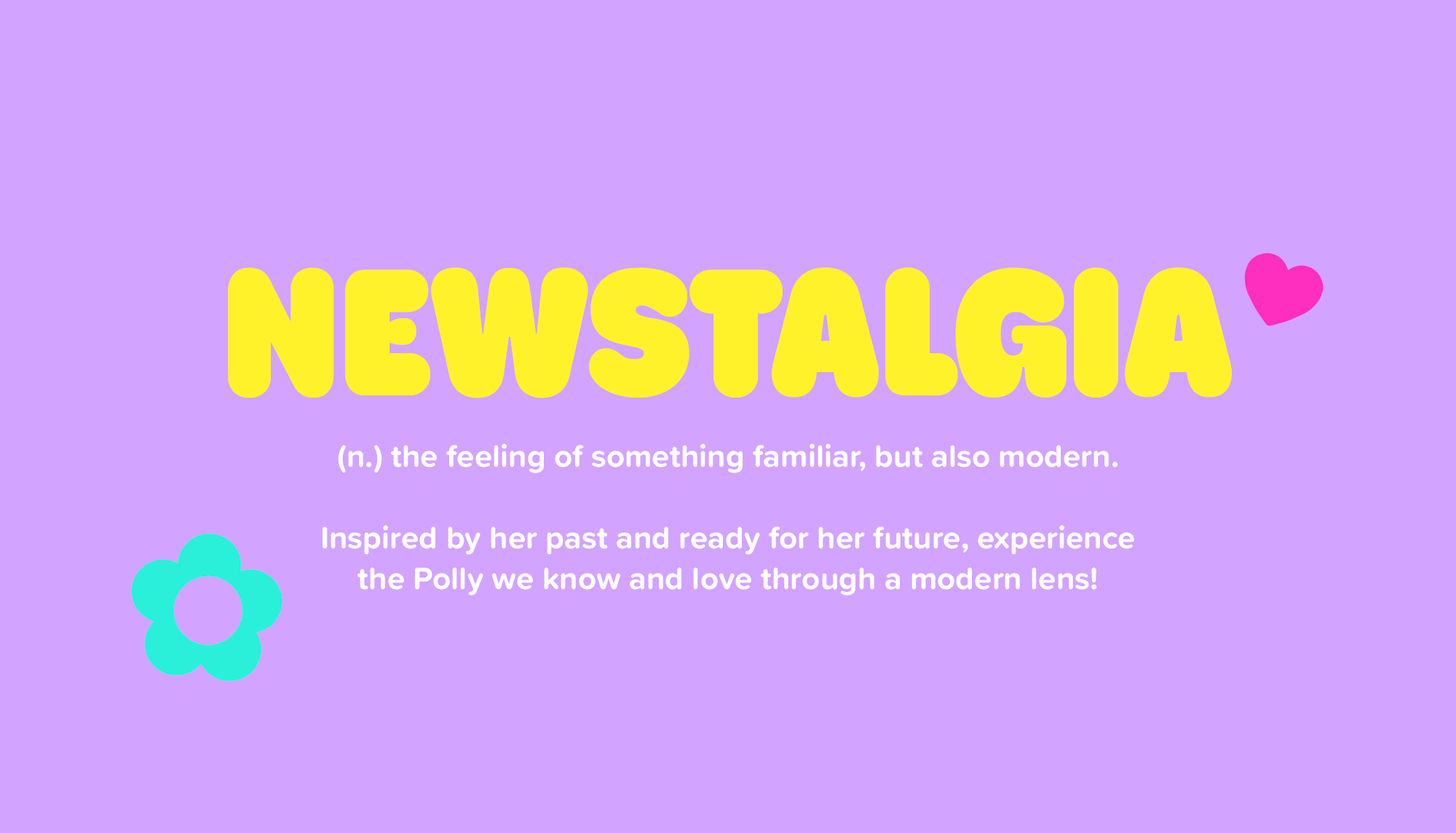
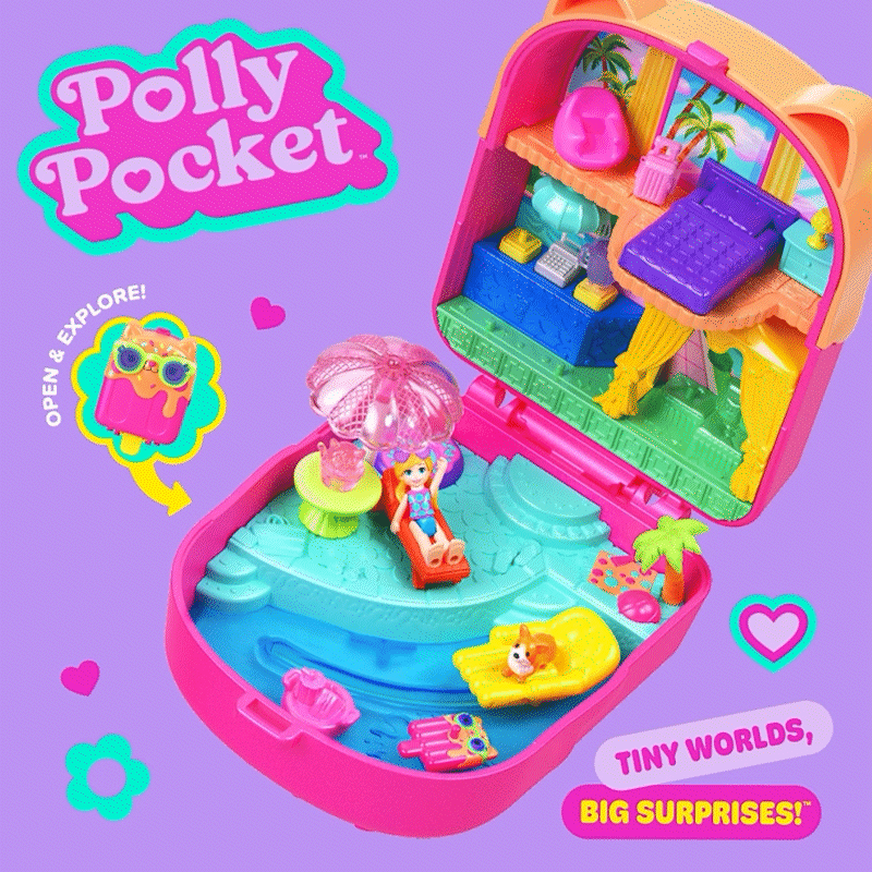
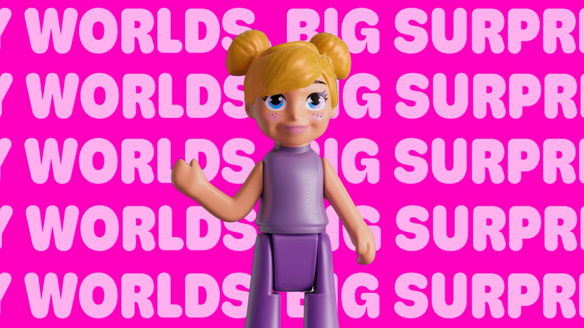
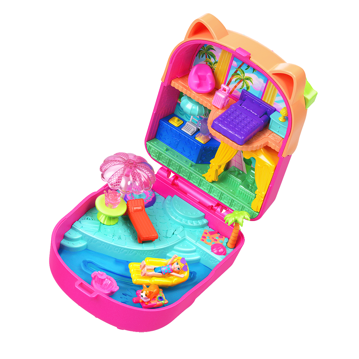
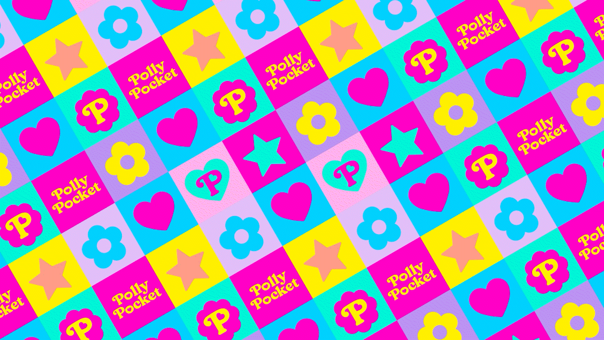
In 2025, Polly Pocket underwent a massive makeover, tapping into her nostalgic 90’s roots invoking newstalgia for og millennial fans and younger fans alike.
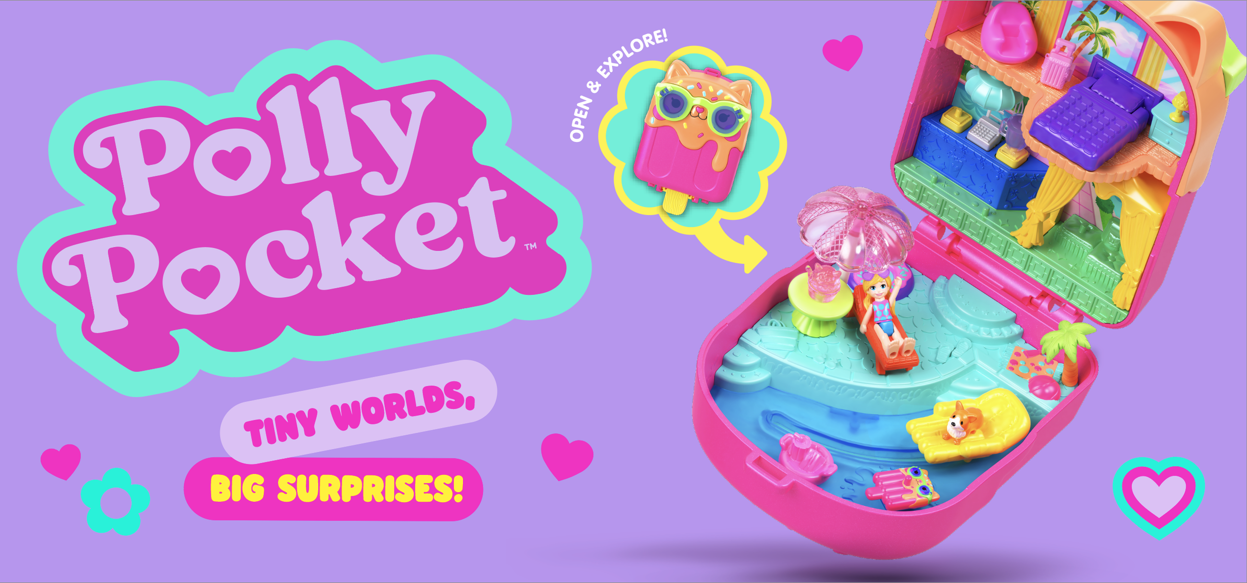
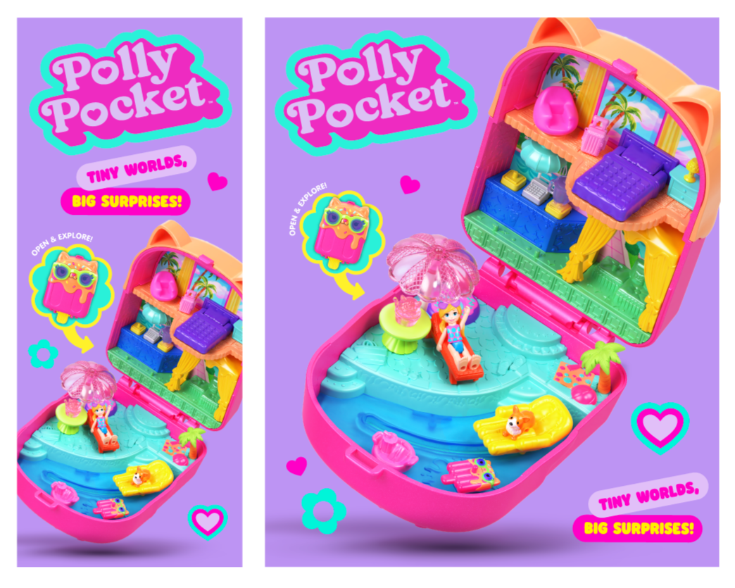
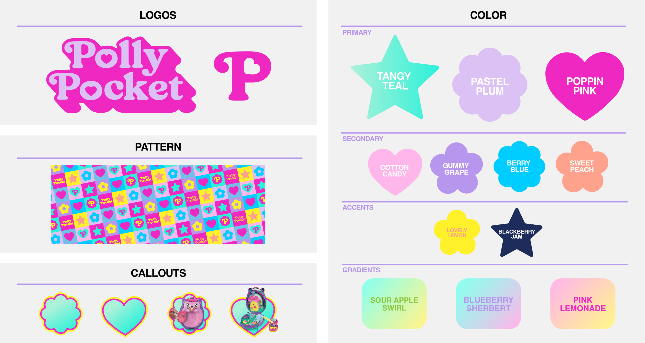
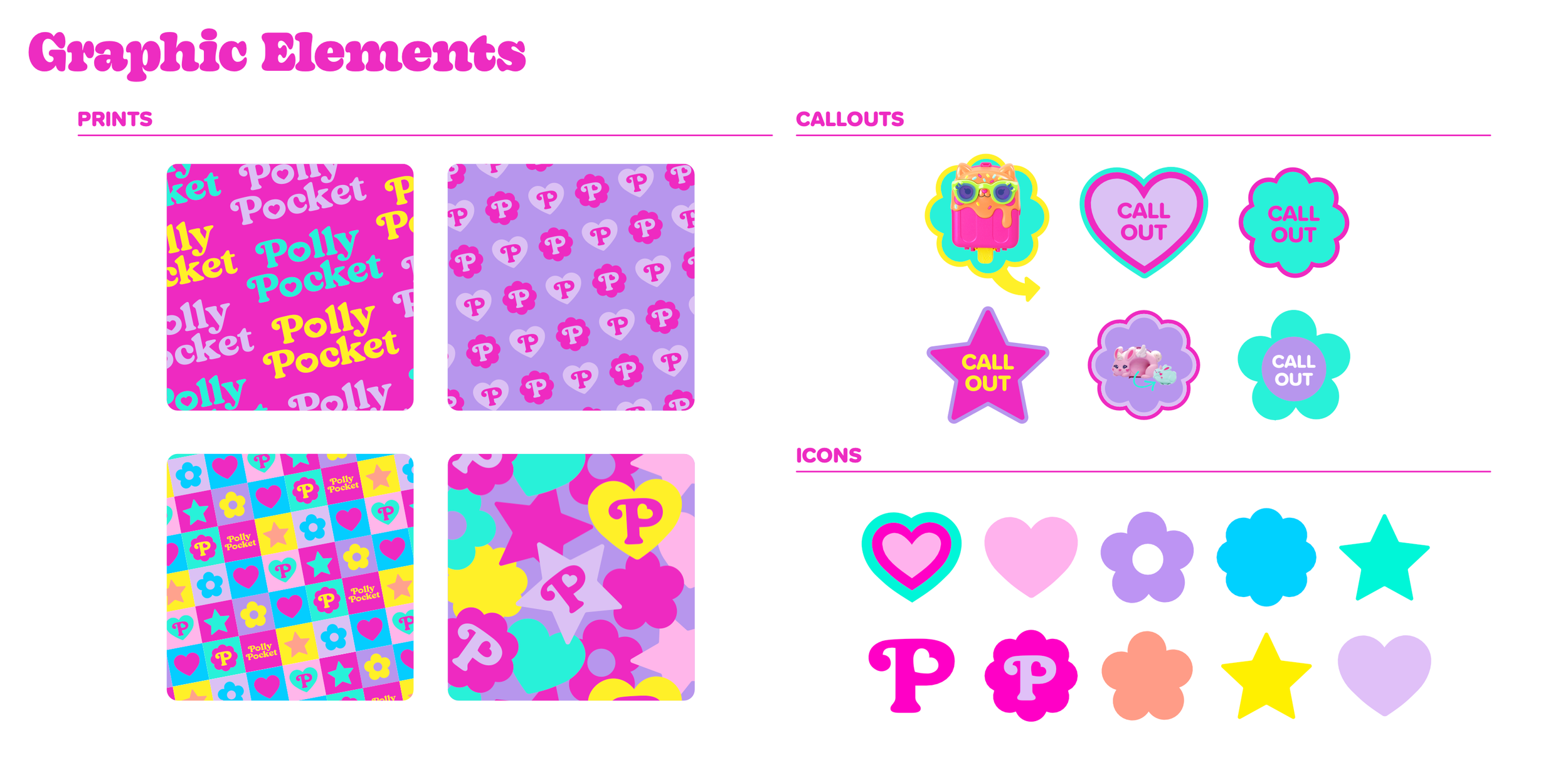
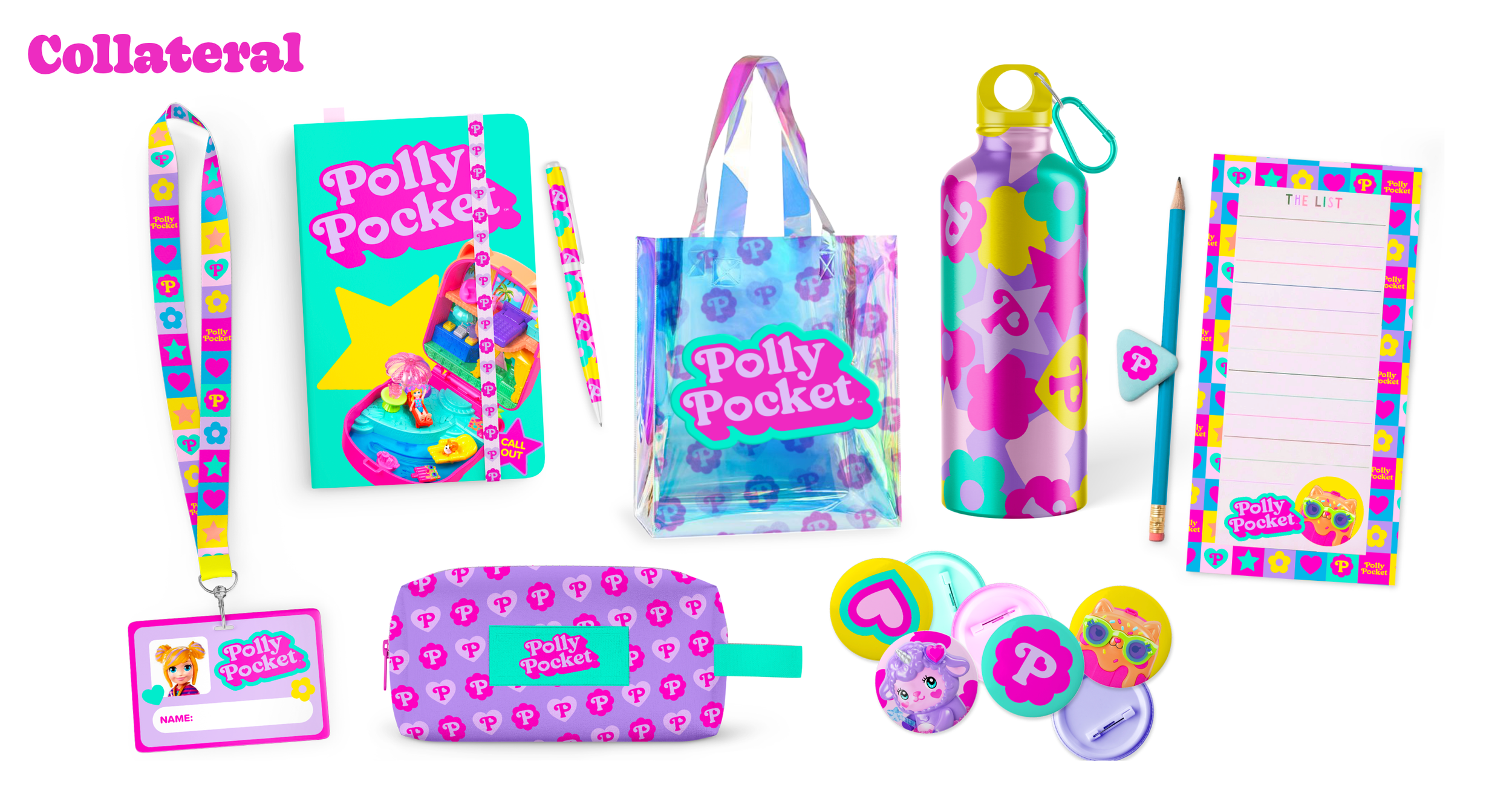
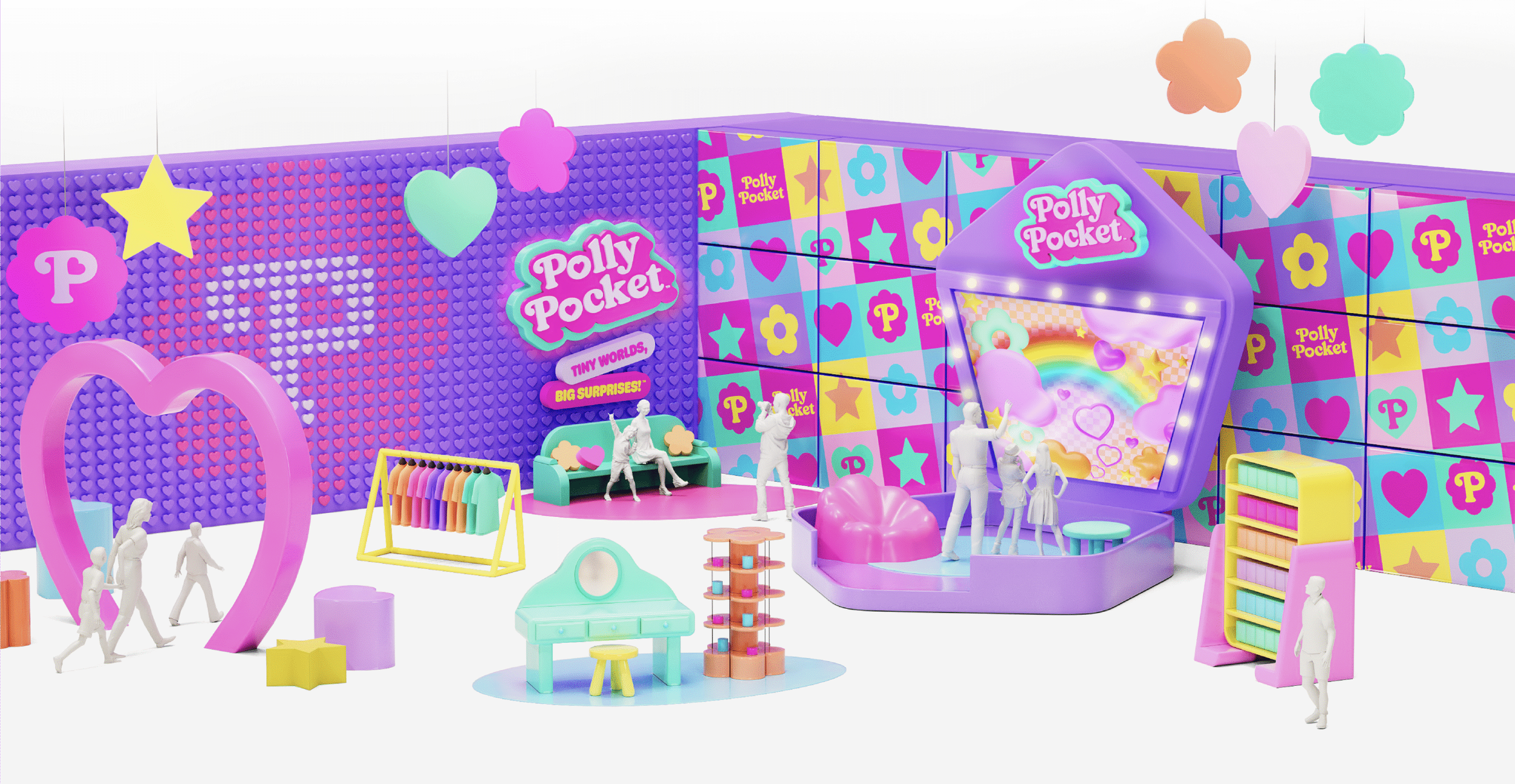
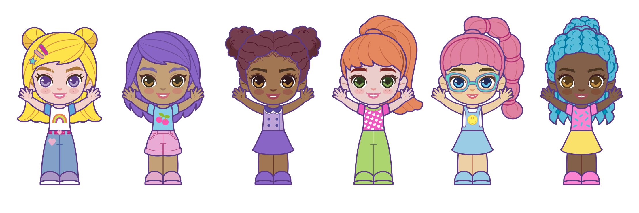
Coming off of her BIG 35th birthday, we took the moment to shake up the visual branding so that it would reflect a more modern era for Polly Pocket: one that leans into joyful & energetic fun, a whimsical sense of adventure, playful nostalgia, and that encourages anyone—of any age—to believe they can do what they set their minds to, no matter their how “tiny” they may be. I led creative direction and design for the Polly Pocket 2025 rebrand, rolling out a whole new vibe for our micro bestie. From concept to completion, I worked with our agency design partner to redefine the the look, tone, and overall feel of one of millennials’ most beloved brands, ushering it into a new age of playfulness and leaning into major NEWSTALGIA vibes with a bold new look to match. The new look carries the soft, playful spirit of the 90’s era Polly forward, keeping the original charming legacy of Polly Pocket that OG fans know & love, and opens-up a whole new pocket-sized world for kids. Fresh, colourful, bold, and full of surprise, it invites both generations to unlock the joy of endless adventures.
responsibilities included: establishing the brand system (i.e, color palette, typography, patterns, icons, photography style, doll posing) and key art, creative directing all product shoots from concept to completion, brand guidelines + style guide, leading a team of designers to ensure a cohesive brand system across all assets and applications, approving all future executions from global markets.
creative design production: analogue studio
design support: logan lebuis, melinda puentes